Client
SuperBaggage
Status
Completed
Duration
2 weeks
Location
Madison, WI
What is a digital prototype?
We love designing and building digital prototypes. They give our clients a vision of the future. It's usually affordable and fast (as quick as two weeks). And in the long run, prototypes help save a lot of money and headaches, because it's easy to make changes at the prototype stage when the designs are just digital.
Case Study
This is a case study on one digital prototype we created for the Airline Industry. It’s an iOS app. We created it to show airlines and baggage companies what’s possible. It helped them see the future for an iOS app to be used to scan and track baggage.
And that’s what digital prototypes do. They help you see the future, and make changes to the future design when it’s easy to do.
Main benefits of a prototype

Get Your Team On The Same Page
You get to see the workflow and design of the software product/app you have in mind. You get to click through screens and understand the user experience.

Make Changes Now
Making changes to the design or workflow at this stage is easy and cheap. This is the time to do it. Making changes after the application is being developed/coded is much more costly and hard.

Get Buy In From Your Colleagues
Let your team click through and see your idea become reality.
Solution

Frontend
Built using a cross-platform framework for a responsive and consistent user experience.

Authentication
Secured with a robust identity and access management service.

Backend
Implemented with serverless and microservices architecture for modularity and efficiency.

Database
Leveraged a relational database with additional capabilities for handling temporal and analytical data.
Integrations
Connected with enterprise tools for seamless geospatial and design workflows.

Payment Gateway
Integrated a leading payment gateway for secure transaction processing.
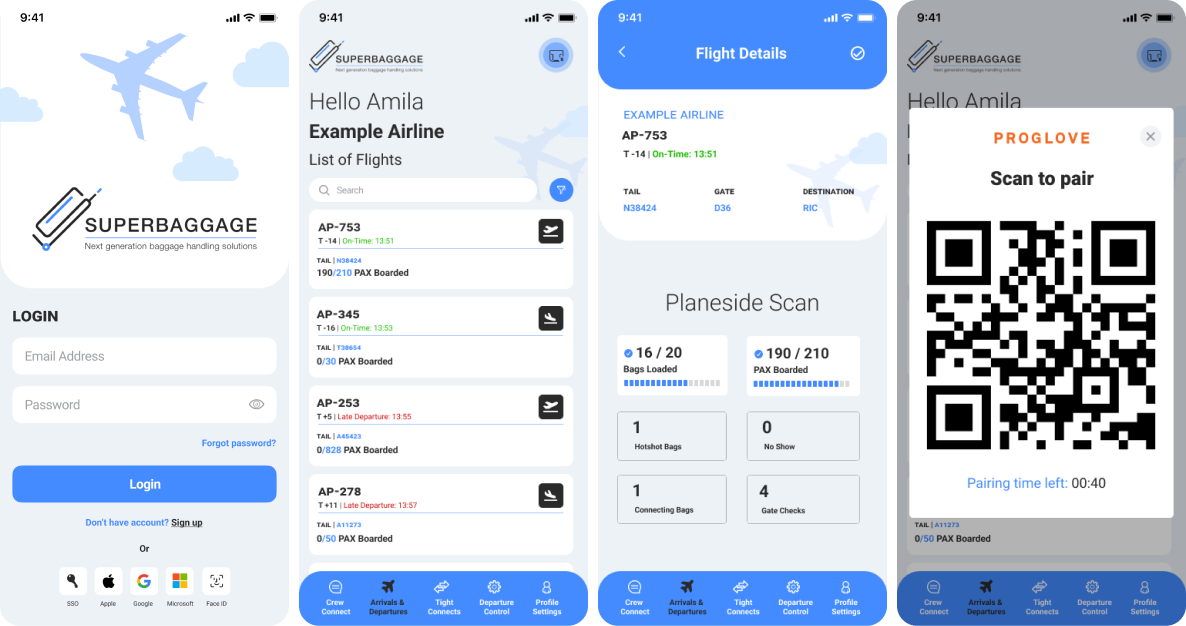
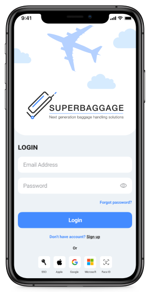
Here are some screens from our SuperBaggage app we designed:
First Week:
We took input from an aviation expert to build the screens. We would build the first 2-3 important screens, then send those screens to the expert. They would make edits and suggestions and we would send it back until it looked great and met their needs.
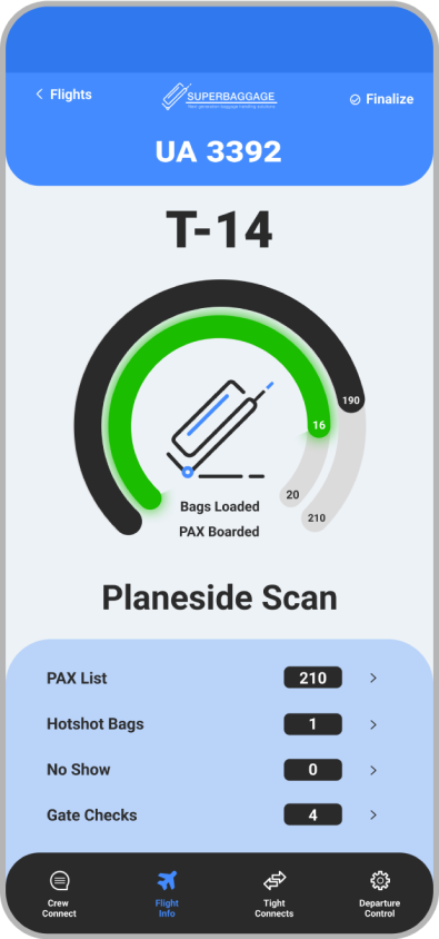
Here is a very early image that our designer put together. It looks nice but the data and information needs do not match what a baggage handler would need.
Second week:
We would build additional screens and flesh out the app some more. We also showed it to additional baggage experts to get more feedback.
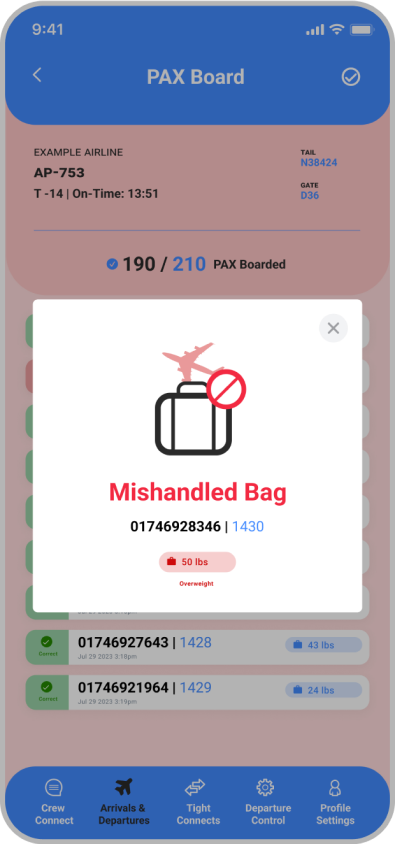
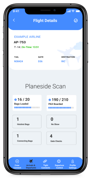
This is a later iteration of the previous screen. It provides more details and the data that is needed. This screens shows when a bag is mishandled. Check out the bottom menu. It's very different than the earlier version shared above.
By the end of the second week we had a digital prototype that looked professional and would allow people to easily make comments about its functionality and user experience.
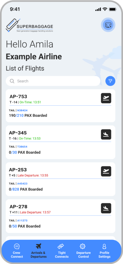
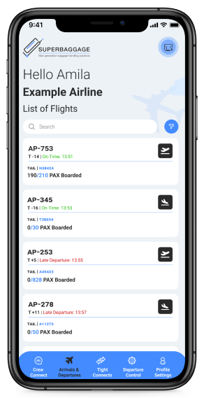
This screen shows the incoming fights, so the Baggage Handler can select a flight to work on. A digital prototype helps your team to understand the entire workflow and content digitally before implementing the code.
With all of these screens, users can click on certain buttons that will be take them to the next screen. See the following layout for the screens in Figma. This all took about 2-3 weeks to finish with about 4-5 updates based on feedback and direction from the client.
That's what we love digital prototypes. They're fast, affordable and they help bring the entire team and content together.
