Better, More Efficient App Design
May 10, 2016
I just read this great article on the future of apps and bots.
The writer talks a lot about his experience in China. Sounds awesome. But I’m not sure if all of it applies to those of us in the US. Right now our messaging and apps aren’t set up in the same way they are in China. I hope they will be over time.
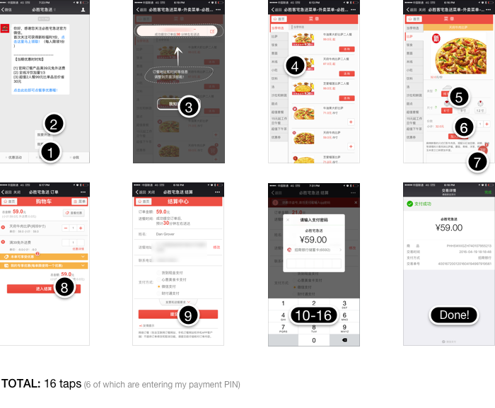
The article talks a lot about WeChat, which is the dominant chat platform in China. You can do everything through this platform (pay utility bills, chat with friends, buy pizza, call an uber). It’s impressive.
What is especially nice about it is how they designed the main screens to make you super productive. It’s all about productivity and efficiency, and somewhat discovery. The main screen is set up around your messages. And then you can quick navigate to buy a pizza or pay your utility bill from there.
When you go to buy a pizza, you don’t message using natural language, like “I want to buy a pizza”. Instead it’s more like an app experience. It’s more visual. And you can input instructions using numbers not natural language. That’s smart. I always thought with Microsoft chatbots you would start typing with companies using natural language. After reading this article that doesn’t make any sense at all. It’s much more efficient to use numbers and visuals to quickly select and move the engagement on.
With the WeChat example you don’t have to download the Pizza Hut app to make it happen.
So what are the key take-aways? The app ecosystem experience needs to improve on our phone. We’re all sick of downloading a new app for everything. Everyone feels that messaging platforms like Whatsapp or Messenger or Kik will step up with something more like WeChat. I think it’ll make our lives easier both from a consumer and developer perspective.
In the near future, creating chatbots should be done closely with apps in mind. The combination of chatbot capabilities, quick interactions with text and the visual navigation system with apps, is powerful.
Also, we have always pushed for a clean look and feel to an app. I think that’s what Americans have wanted. But now I wonder. Check out this image from the article on Guangzhou Metro’s home page on their app. It’s a mess, but you can navigate quickly.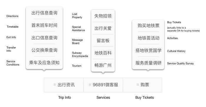
In the US, if I saw an app like this I would assume it is horribly designed. But now I’m not sure. With this transit app, you want to connect with it, find what you’re looking for quickly, and get out. I don’t need an amazing user experience, I need efficiency (usually). Of course it’s different if you’re selling boutique dresses.
Ideally the transit app above would learn your preferences. If you’re always clicking on Buy Tickets and Timetable, those should be the top two choices. Get in get out, fast.
Related posts
Curious about CI/CD… what it means and why you should care about it?
Augment’s got you covered! You may have heard the term “CI/CD” thrown around in software development discussions and internal meetings, but it’s not frequently discussed as to “why” it matters. CI/CD stands for Continuous Integration and Continuous Delivery (or Deployment, depending on the team). It is a set of practices that helps teams deliver code …

Introducing Auggy AI: A Conversational AI Assistant
Embracing AI sounds easy but it’s often hard to know what and how to implement AI. To that end, we built an internal custom AI assistant. Our AI assistant Auggy is built to respond accurately to questions regarding our internal policies, manage project tasks, and provide updates on JIRA, to create, and view events, allowing …

Why AI
Why are we excited about AI? There is definitely a lot of hype around AI. The hype is exciting but also deafening sometimes. Everyone feels the pressure to build and engage with AI. It’s magical, life changing. That’s kind of all true. But there is a lot of work to be done to achieve that …
